Opinion: In defense of a progressive, modern addition to the Château Laurier

We at Ottawa Showbox don’t typically post editorials, particularly those which have nothing to do with music. However, I like to think that we’re a community-oriented website, and so every once in a while we can discuss other issues facing our community. My hope with this post is to shed some light on the other side of the Fairmont Château Laurier debate—one which has been unfairly covered by local media. I haven’t seen one article in defense of the proposed modern addition. So, as any frustrated writer does, I started writing. Since I didn’t get a response back from the Citizen’s op-ed desk, I’m asserting my editorial authority and posting it on here.
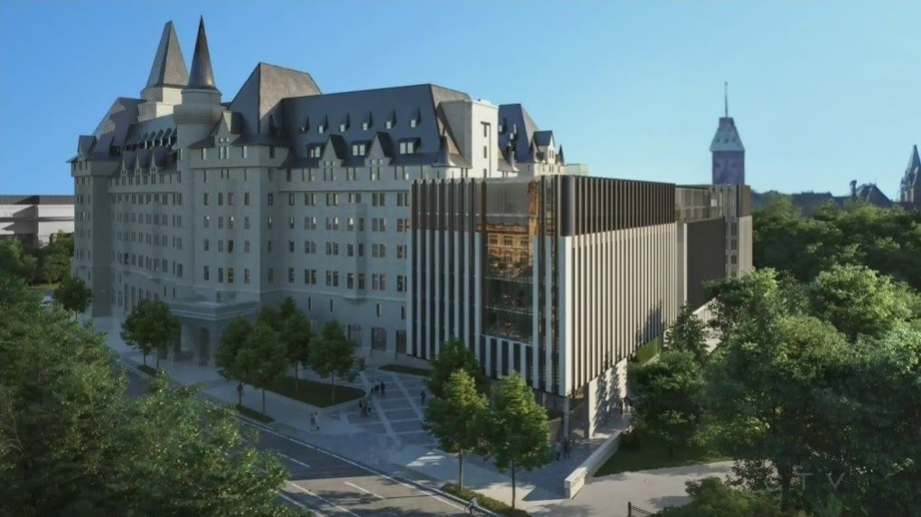
Rarely is there as divisive an issue among Ottawa residents and City Councillors as the design of the Fairmont Château Laurier’s new addition.The only other time I can think of this kind of fury taking over the capital is when Kanye West headlined RBC Ottawa Bluesfest a few years back. It really makes one wonder where our priorities are with respect to the public interest and well-being of our city.
I am fully prepared to not make any new friends among distraught readers and opponents of the modern design of the Château’s addition. I just hope that they read this whole article first before casting their judgement, and also realize that our city faces much bigger problems than the look of a hotel’s new addition.
There are reasons why Ottawa is known as a “boring government town” or “the city that fun forgot.” It’s because there are a lot of boring, comfortable people that live here who relish their position as part of the status quo. In this case, their indignation towards architectsAlliance, the architectural group that is spearheading the design of the addition, is typical—and expected. Why? Because Ottawa is a city that takes one step forward with progress, and then takes three steps back. It’s a city where restaurant chains and Starbucks are the norm, and where the arts are pushed beneath the surface and forced to survive within the confines of what’s “comfortable” for the public. Ottawa is a city that does not easily embrace change or challenge the status quo. I’m not suggesting that everyone who is in opposition to the current design proposal is inherently boring, however I do think that those who argue in favour of a remake of the old design are part of the reason Ottawa continues to be referred to as bland. Frankly, they’re a huge part of the problem that is holding this city back.
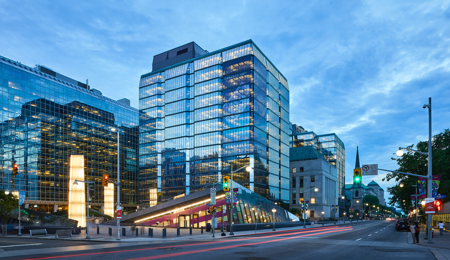
We’re a city whose edgiest downtown architecture is the angular facade of the Bank of Canada Museum adjacent to its head office complex.
The BoC building was built in 1937-1938 in the late neoclassical style with grey granite from Quebec. The building itself won a myriad of architectural awards, including the Gold Medal from the Royal Architectural Institute of Canada. The original stone facade is beautiful, to be sure. The modern glass structure addition which was built overtop of the original stone building was completed in 1979. In 2000, it was named by the Royal Architectural Institute of Canada as one of the top 500 buildings produced in Canada during the last millennium.
Ironically, the glass addition to the BoC is also shaped like a box. The design is also in direct opposition to the original neo-classical style of the old building. Sound familiar? The BoC’s modern addition is an example of architectural forethought and progressive design.

Just because one doesn’t see the process or value in a design doesn’t mean it’s not there. A lot of work and planning goes into these projects, and those who whimsically comment on its ugliness tend not to appreciate that design encompasses more than just the outward-facing form. There’s more to it than meets the eye. For example, the current proposal takes into consideration energy conservation and is made to be a next-generation eco-friendly building. There is more to understand about a building’s design than just its aesthetics. I also should point out that opinions of how things “look” are subjective, and are not unanimous. Although the local media’s coverage of the issue maybe make it seem that way, the truth is that there are lots of world-class architects and designers who would consider the current proposal a brave and stunning addition to our city’s architectural landscape.
Second, design by committee doesn’t work. The Château Laurier is a privately-owned institution that should be able to operate and make decisions about its architectural direction without complaints from some angry tweeters and commenters. But even more dangerous of a precedent is the City of Ottawa getting involved. Multiple Councillors threatening to take away the hotel’s heritage status, in a weak-willed move that makes them look as though they’re fighting for the people, yet actually harming Ottawa’s progress towards a city of the future. This whimsical heavy-handedness by Councillors like Catherine McKenney and Mathieu Fleury (both of whom I am normally extremely happy with, as they clearly care about their communities) has no place in the domain of private enterprise or architectural decision-making, and serve as a bold reminder that Councillors can act on the temperaments of angry members of the community without thinking of the future implications of such a precedent.
It’s like if a child doesn’t like the rules of the ball game they’re playing because they’re losing. The child may angrily pick up the ball mid-game and storm off, but the ball is not theirs and the rules are not theirs to re-write.
Let the design professionals do their job.
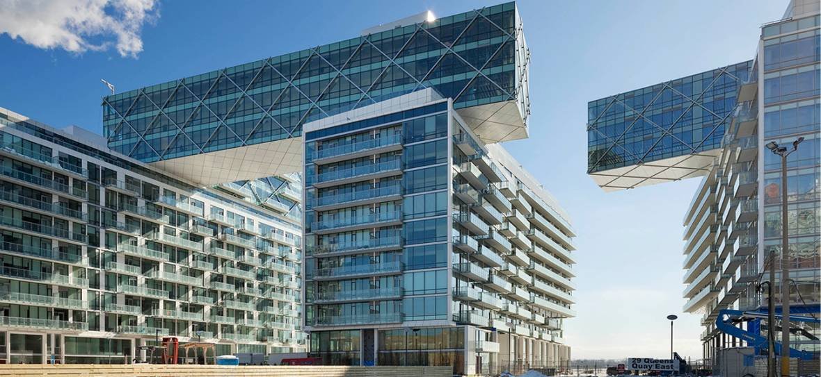
Lastly, designers have always pushed artistic boundaries. Art and design should be disruptive.That’s why we no longer live in medieval castles or wooden barns. For people in the 1800s, the CN tower would have looked deplorable and frightening. But to move forward as a society, disruptors are needed—particularly in the field of architectural design. In this case, the Toronto-based architectsAlliance group has spearheaded several massive, progressive projects such as UofT’s Centre for Civilizations, Cultures & Cities, the Terrence Donnelly Centre for Cellular and Biomolecular Research, and perhaps most impressively—Toronto’s breathtaking Pier 27 development that has modernized and transformed the waterfront. We must look beyond the public’s one-dimensional analysis of it looking like a “box” or an “air conditioner.”
We must look beyond the public’s one-dimensional analysis of it looking like a “box” or an “air conditioner.” Most buildings look like boxes, if you think about it. And I think if we all took a deeper look into the intricacies of the design instead of how it looks from 500 meters away, we might have a new perspective on the thing as a whole.

To conclude, any forward-thinking modern design of the Château’s addition is better than reverting to an outdated, passe one. Discomfort and disruption are the drivers of change. City councillors and the general public should leave the design alone, and let architects do their job. The current “box” design may not be perfect, and criticism by peers in the architectural design industry should be welcomed. However, this heavy-handedness is unwarranted, inappropriate, and ultimately harmful. Reverting to the default position that the addition should just look like the rest of the building (or something similar) is regressive and will negatively affect how the rest of the country and the world perceive us.
A better, disruptive, modern architectural design for the Château Laurier should be part of Ottawa’s vibrant future as a global capital. But it’s not what Ottawa deserves. Until Ottawa’s residents and Councillors stop getting up in arms over things like a modern architectural addition on the Château Laurier, Ottawa will continue to be the comfortable, boring city that we continue to be known for. Hopefully now that the bid to retract the Château’s heritage status has fizzled out we can get back to focusing on more serious challenges such as affordable housing or access to services in our city. But maybe getting up in arms over those more important issues is too much to ask.
